ButtonGroup
A customizable submit button component for order submission. This component handles the complete order submission flow including form validation, payment processing, 3DS authentication, error handling, and success messaging. It automatically manages button states (enabled, disabled, processing, complete) and displays appropriate feedback to users.
- Must be used inside
CheckoutProvider. - Automatically validates form before submission.
- Handles payment errors with user-friendly messages.
- Supports 3DS authentication flow.
- Displays loading states and success/error messages.

Props
buttonText
Custom text or React node to display on the button.
buttonText?: string | React.ReactNode = 'Complete Order'showSecurityText
Whether to display the security message below the button.
showSecurityText?: boolean = trueonOrderSubmit
Callback function triggered when the user clicks the submit button, before order creation begins.
onOrderSubmit?: (products: CheckoutCartItem[], totalAmount: number, setMetadata: (metadata: Record<string, string>) => void) => void| Parameter | Type | Description |
|---|---|---|
| products | CheckoutCartItem[] | Submitted cart items array |
| totalAmount | number | Total amount at submission time in cents (e.g., 9999 represents $99.99) |
| setMetadata | (metadata: Record<string, string>) => void | Function to dynamically set metadata for the order |
onOrderCreated
Callback function triggered when the order is successfully created.
onOrderCreated?: (result: OrderSubmissionResult) => voidonOrderSuccess
Callback function triggered when the payment is successfully processed.
onOrderSuccess?: (orderCode: string, tradeCode?: string) => void| Parameter | Type | Description |
|---|---|---|
| orderCode | string | Order code |
| tradeCode | string | Trade code (optional) |
styles
Custom CSS styles for the component. Supports nested style objects for different parts of the component.
styles?: React.CSSProperties & {
  root?: React.CSSProperties;
  button?: React.CSSProperties;
  buttonContent?: React.CSSProperties;
}| Property | Description |
|---|---|
| root | Styles for the root container |
| button | Styles for the submit button |
| buttonContent | Styles for the button text/content |
Default Button States
The ButtonGroup component automatically manages different visual states based on the order submission flow. The following states show the default appearance when no custom configuration or styles are provided:
Default State
The button is disabled by default and becomes active only when the form is valid.
Active State

Success State
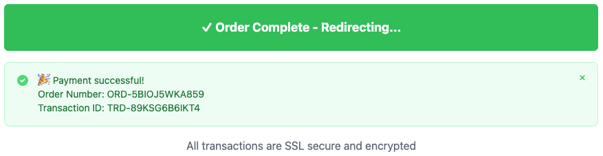
After successful order submission, the button displays "✓ Order Complete - Redirecting..." and shows a success message with order details.
Error State
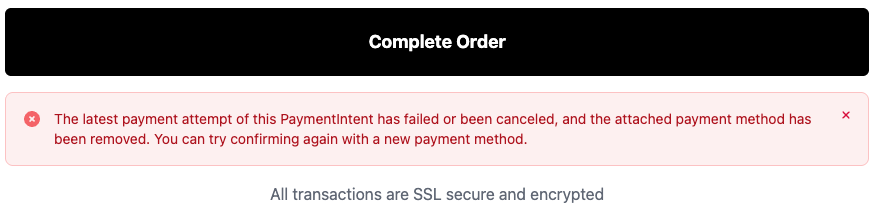
When an error occurs during submission, an error message is displayed below the button with details about what went wrong.
Usage Examples
import { ButtonGroup } from '@clickaroo/checkout-ui';

function CustomCheckout() {
  return (
    <ButtonGroup
      buttonText="Place Order"
      showSecurityText={true}
      onOrderSubmit={(products, totalAmount, setMetadata) => {
        console.log('Order submitted');
        setMetadata({
          orderSource: 'web',
        });
      }}
      onOrderCreated={(result) => {
        console.log('Order created:', result.orderCode);
      }}
      onOrderSuccess={(orderCode, tradeCode) => {
        console.log('Order successful:', orderCode, tradeCode);
      }}
      styles={{
        root: {
          marginTop: '20px',
        },
        button: {
          fontSize: '18px',
        },
      }}
    />
  );
}